When you run any type of home improvement business, it’s easy to focus on developing your client base and a reputation for excellence. However, you may lack the time and resources to focus on your website. For most home improvement companies, the website lacks some key features which drive user engagement.
In a recent survey, researchers found about 82 percent of mobile users conduct “near me” searches on a regular basis. If you want to engage people searching for brands near them, you need a strong online presence. Even if the user ultimately phones or comes to your physical place of business, you need to make an impression initially for them to choose you as one of their options for home improvement.
There are some common issues in small business web design which cause users to bounce away to a competitor’s site. Here are nine things your home improvement site might lack and how you can fix them.
#1. Engaging Headline
If you want people to click on your website link when searching for nearby businesses, you must create headlines that grab user attention. Headlines should be around six words or less. In that small amount of text, you have to explain what the article is about and grab attention. It isn’t an easy task and there’s a reason people train for years to learn how to write effective copy.
Incorporate strong action words and study what headlines others use so you can make yours different but follow a language pattern that works. The best way to learn how to write strong headlines is by studying some of the best existing headlines. Do your own searches on home improvement topics and see what results pop up. What are the headlines for the sites ranked by Google for the first page? What kind of pattern do they follow?
#2. Strong Subheadings
The next thing most people look at when landing on your website is the subheadings. There is a text hierarchy on most sites where the headline is the largest text and thus signals most important. Next comes the subheadings and then the body text. Since the subheadings are the second thing visitors look at, they can be a bit more detailed but should still grab the reader. You have a limited amount of text which you must use to maximum effect.
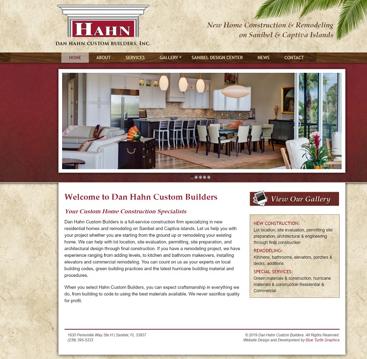
Dan Hahn Custom Builders does an excellent job using their subheadings to define their services further. They use the subheading “Your Custom Home Construction Specialists,” but they also use a subheading to show they do both construction and remodeling and where, which reads “New Home Construction & Remodeling on Sanibel and Captiva Islands.”
#3. Scanability
Think about the average person today and their behaviors. Most people are busy and access the Internet on their smartphones while on the run. They may have a few minutes between meetings, a moment at their child’s soccer practice or a little time before dinner to browse the Internet and find the information they need. Because of this trend, people scan over the websites they visit, absorbing images and headlines as quickly as possible.
Ensure your site is scannable by creating smaller blocks of text and utilizing subheadings and bullet points. Think about how to break information down so people can absorb quickly. Place the most important items first.
#4. Navigational Hierarchy
When visitors land on your page, they expect a certain setup. Most sites have a logo top left or center which links back to the home page. In the navigation bar, they expect to see a home button to the left and a contact button to the right. Your navigational hierarchy goes even deeper than just the top navigation, though. You’ll also need to think about what categories you need to highlight your products and the subcategories under each category.
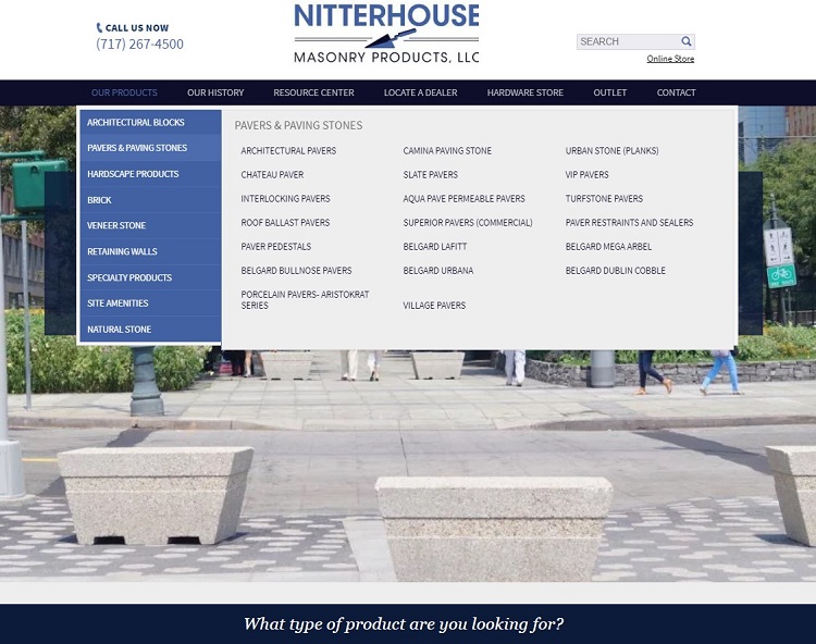
Nitterhouse Masonry Products does a great job with their site hierarchy. Notice how they feature a products option in their main navigation across the top of the page. Click on it and you see subcategories of masonry products, such as architectural blocks, pavers and paving stones, hardscape products and veneer stone. Under each category are subcategories, such as chiseled face blocks and then under those categories are product descriptions. The structure is intuitive and easy for users to figure out.
#5. Relevant Images
In a survey of 500 digital marketers, professionals revealed 88 percent said they used visuals in at least half of the articles they published on their websites. However, using stock photos isn’t very impressive, because they are often too generic to truly define your business. Instead, you should show your products and services in action. Take shots of your top performing employees at work, share 360-degree views of your best products and add interest and color to your page whenever possible.
#6. Detailed About Page
When people look for a home improvement company, they want to know your brand’s history and how long you’ve done what you do. Your about page helps define you as a brand. Let users get to know you and why you do what you do. Your about page is your opportunity to sell the personality behind your business. Show off your leaders and your good works and capture new leads by remaining the absolute best at what you do, and showing you’re an authority in your field.
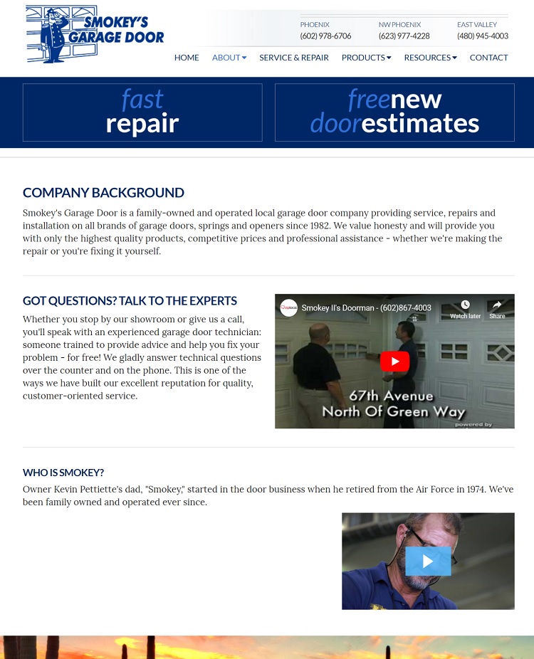
Smokey’s Garage Door of Phoenix, Arizona features a strong about page which talks about the company background, the expertise of their employees and highlights the company’s founder as well as how the business is still family-owned today. The page allows the company to stand out from competitors because of its uniqueness to that particular company and shows its personality.
#7. Unique Value Proposition (UVP)
What do you offer to customers that no one else offers? This is your UVP and highlights the value you bring to the consumer. Your unique value might be that you have the best customer service in the industry or that your product has a special feature no similar products have. If you don’t currently have a UVP, develop one. Improve your delivery times or work on the customer experience (CX).
#8. Emotional Pull
When people feel an emotional connection with your website, they are much more likely to take action. Think about what matters to your target audience. People tend to have powerful feelings about their family and friends and their own personal safety. What types of emotions drive consumers to purchase your services? For example, fear might drive people to get their foundation inspected or to check for termites.
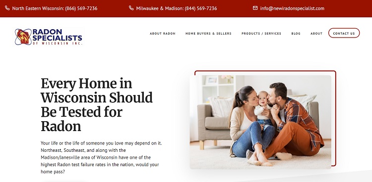
Radon Specialists of Wisconsin highlights on fear by explaining how your life or the life of those you love may depend on you getting your home tested for radon. They also highlight how many homes fail radon tests in the United States and then offer to provide more information for those who visit their site. The image highlights a happy mom and dad with a young child, highlighting what’s most important to most people.
#9. White Space
Over time, your website can become cluttered with too much information. A good design requires white space or your users may not know what to look at first or what action you want them to take. Spend time on each page of your site and ask what the goal is for that page. What do you want the user to do when they land there? Once you have an answer, ruthlessly slash anything that doesn’t match the purpose of the page. If you want customers to contact you for a free quote, then cut anything that doesn’t drive them toward that final result.
Focus on Your Landing Page
When improving your home improvement website, a great place to start is with your landing page. Use the tips above to make that page the absolute best it can be. Conduct split testing to ensure your changes convert visitors into leads. Once your landing page is perfect, you can look at the other elements on your site, but if you have limited time, pour your energy into at least that one vital page.


